Introduction
This article explains how to create buttons on sticky panel in editable ItemsLists. These buttons look as follows:

Creating editable ItemsList
This part is about creating a module, a page and ItemsList widget on the page. Essentially, we just create the same module as explained in the article about editable ItemsLists as an environment for illustrating how to create sticky panel's buttons.
Creating module and page
We start with creating a module with developer ID XCExample and module ID ItemsListStickyPanel. In this module, we create page admin.php?target=sticky_panel_demo, so we create:
empty controller class
\XLite\Module\XCExample\ItemsListStickyPanel\Controller\Admin\StickyPanelDemo<?php
namespace XLite\Module\XCExample\ItemsListStickyPanel\Controller\Admin;
/**
* StickyPanelDemo
*/
class StickyPanelDemo extends \XLite\Controller\Admin\AAdmin
{
}page viewer class
\XLite\Module\XCExample\ItemsListStickyPanel\View\Page\Admin\StickyPanelDemoPagewith the following content:<?php
namespace XLite\Module\XCExample\ItemsListStickyPanel\View\Page\Admin;
/**
* StickyPanelDemoPage
*
* @ListChild (list="admin.center", zone="admin")
*/
class StickyPanelDemoPage extends \XLite\View\AView
{
/**
* Return list of allowed targets
*/
public static function getAllowedTargets()
{
return array_merge(parent::getAllowedTargets(), array('sticky_panel_demo'));
}
/**
* Return widget default template
*/
public function getDefaultTemplate()
{
return 'modules/XCExample/ItemsListStickyPanel/page/sticky_panel_demo/body.twig';
}
}empty template
skins/admin/modules/XCExample/ItemsListStickyPanel/page/sticky_panel_demo/body.twig.
Creating demo entity
Now we need to create an entity that can be edited via our ItemsList.
We create \XLite\Module\XCExample\ItemsListStickyPanel\Model\StickyPanelDemoEntity model class with the following content:
<?php

namespace XLite\Module\XCExample\ItemsListStickyPanel\Model;

/**
 * @Entity
 * @Table (name="sticky_panel_demo_entities")
 */

class StickyPanelDemoEntity extends \XLite\Model\AEntity
{
    /**
     * @Id
     * @GeneratedValue (strategy="AUTO")
     * @Column         (type="integer")
     */
    protected $id;

    /**
     * @Column (type="boolean")
     */
    protected $enabled = true;

    /**
     * @Column (type="text")
     */
    protected $body = '';

    public function getId()
    {
        return $this->id;
    }

    public function getEnabled()
    {
        return $this->enabled;
    }

    public function setEnabled($value)
    {
        $this->enabled = $value;
        return $this;
    }

    public function getBody()
    {
        return $this->body;
    }

    public function setBody($value)
    {
        $this->body = $value;
        return $this;
    }
}
and then an empty repository class for this model \XLite\Module\XCExample\ItemsListStickyPanel\Model\Repo\StickyPanelDemoEntity:
<?php

namespace XLite\Module\XCExample\ItemsListStickyPanel\Model\Repo;

class StickyPanelDemoEntity extends \XLite\Model\Repo\ARepo
{
}
Creating ItemsList widget
We create main ItemsList class \XLite\Module\XCExample\ItemsListStickyPanel\View\ItemsList\Model\StickyPanelDemoEntity as follows:
<?php

namespace XLite\Module\XCExample\ItemsListStickyPanel\View\ItemsList\Model;

class StickyPanelDemoEntity extends \XLite\View\ItemsList\Model\Table
{
    protected function defineColumns()
    {
        return array(
            'body' => array(
                static::COLUMN_CLASS    => 'XLite\View\FormField\Inline\Input\Text',
                static::COLUMN_NAME     => static::t('Entity body'),
                static::COLUMN_ORDERBY  => 100,
            ),

        );
    }

    protected function defineRepositoryName()
    {
        return 'XLite\Module\XCExample\ItemsListStickyPanel\Model\StickyPanelDemoEntity';
    }

    protected function isSwitchable()
    {
        return true;
    }

    protected function isRemoved()
    {
        return true;
    }

    protected function isInlineCreation()
    {
        return static::CREATE_INLINE_BOTTOM;
    }

    protected function getCreateURL()
    {
        return \XLite\Core\Converter::buildUrl('sticky_panel_demo');
    }

    protected function isSelectable()
    {
        return true;
    }

    protected function wrapWithFormByDefault()
    {
        return true;
    }

    protected function getFormTarget()
    {
        return 'sticky_panel_demo';
    }
}
and then add this ItemsList to our page. For that, edit skins/admin/modules/XCExample/ItemsListStickyPanel/page/sticky_panel_demo/body.twig template and define its content as follows:
{{ widget('\\XLite\\Module\\XCExample\\ItemsListStickyPanel\\View\\ItemsList\\Model\\StickyPanelDemoEntity') }}
As a result we should get an ItemsList like this:

and our preparation is over.
Assigning custom sticky panel to ItemsList
First of all, we need to understand what sticky panel class is used in our ItemsList. For that, let us add getPanelClass() method to our ItemsList widget and define it as follows:
protected function getPanelClass()
{
    $result = parent::getPanelClass();

    var_dump($result);

    return $result;
}
As you may have guessed, getPanelClass() method defines what class is responsible for sticky panel in ItemsList. When you refresh the page, you will see that it is \XLite\View\StickyPanel\ItemsListForm class by default. Our custom sticky panel will inherit this class, so we create \XLite\Module\XCExample\ItemsListStickyPanel\View\StickyPanel\DemoEntity class with the following content:
namespace XLite\Module\XCExample\ItemsListStickyPanel\View\StickyPanel;

class DemoEntity extends \XLite\View\StickyPanel\ItemsListForm
{}
We also define \XLite\Module\XCExample\ItemsListStickyPanel\View\ItemsList\Model\StickyPanelDemoEntity::getPanelClass() method as follows
protected function getPanelClass()
{
    return 'XLite\Module\XCExample\ItemsListStickyPanel\View\StickyPanel\DemoEntity';
}
which means that our ItemsList will start using newly created sticky panel. Even though, this sticky panel is exactly the same as default one, we will change it soon.
About buttons in sticky panel
There are three types of buttons in sticky panel:
- main button that has orange color;
- additional buttons that separated by 'or' label from main button;
- other buttons.

All buttons are .btn elements from Bootstrap: https://getbootstrap.com/docs/3.3/components/#btn-groups
Changing main button
Main button of any sticky panel is defined by the \XLite\View\StickyPanel\ItemForm::getSaveWidget() method. \XLite\View\StickyPanel\ItemForm class is an ancestor of the \XLite\View\StickyPanel\ItemsListForm class that we extend.
If we want to change main button, we can either change this method, here is its default implementation:
protected function getSaveWidget()
{
    return $this->getWidget(
        array(
            'style'    => 'action submit',
            'label'    => $this->getSaveWidgetLabel(),
            'disabled' => true,
            \XLite\View\Button\AButton::PARAM_BTN_TYPE => $this->getSaveWidgetStyle(),
        ),
        'XLite\View\Button\Submit'
    );
}
or if we have some simple task, we can just implement our own versions of getSaveWidgetLabel() and getSaveWidgetStyle() methods.
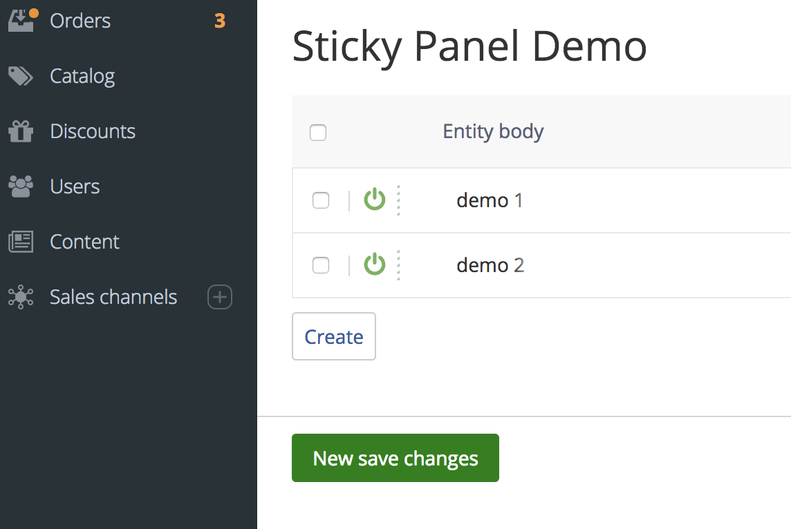
E.g. our task is to define main button having green color and 'New save changes' label on it. In this case, we add following methods to our \XLite\Module\XCExample\ItemsListStickyPanel\View\StickyPanel\DemoEntity class:
protected function getSaveWidgetLabel()
{
    return static::t('New save changes');
}

protected function getSaveWidgetStyle()
{
    return parent::getSaveWidgetStyle() . ' green-main-button';
}
This change will change a label on the button, but we still need to apply CSS rules to make a button green. So, we add getCSSFiles() method to our sticky panel class:
public function getCSSFiles()
{
    return array_merge(
        parent::getCSSFiles(),
        ['modules/XCExample/ItemsListStickyPanel/css/style.css']
    );
}
and create skins/customer/modules/XCExample/ItemsListStickyPanel/css/style.css CSS file with the following content:
.green-main-button, .green-main-button.disabled,
.green-main-button:hover, .green-main-button.disabled:hover,
.green-main-button:focus, .green-main-button.disabled:focus,
.green-main-button:active, .green-main-button.disabled:active,
.btn.green-main-button:focus:hover, .btn.green-main-button:focus
{
    background-color: green;
    border-color: green;
}
These changes will make main button green and with 'New save changes' label on it.
Adding more buttons
Let us add a new button to the ItemsList that can submit the form with another action.
We start with creating a new button that is going to be used in our sticky panel. We create \XLite\Module\XCExample\ItemsListStickyPanel\View\Button\DemoOne class as follows:
<?php

namespace XLite\Module\XCExample\ItemsListStickyPanel\View\Button;

class DemoOne extends \XLite\View\Button\Regular
{
}
Essentially, this is just regular \XLite\View\Button\Regular button with no additional parameters and functionality, but we can change it as needed.
Now, we register this button as a button in our sticky panel class. For that we create \XLite\Module\XCExample\ItemsListStickyPanel\View\StickyPanel\DemoEntity::defineButtons() method as follows:
protected function defineButtons()
{
    $list = parent::defineButtons();

    $list['mybutton'] = $this->getWidget(
        [],
        'XLite\Module\XCExample\ItemsListStickyPanel\View\Button\DemoOne'
    );

    return $list;
}
and we want to define some parameters for this button: label, action for submitting the request, CSS class.
We can do that inside \XLite\Module\XCExample\ItemsListStickyPanel\View\Button\DemoOne class like this:
<?php

namespace XLite\Module\XCExample\ItemsListStickyPanel\View\Button;

class DemoOne extends \XLite\View\Button\Regular
{
    protected function getDefaultAction()
    {
        return 'demo_one';
    }

    protected function getDefaultLabel()
    {
        return 'Demo Button 1';
    }

    protected function getDefaultStyle()
    {
        return parent::getDefaultStyle() . ' always-enabled';
    }
}
or we can pass these parameters from inside defineButtons() method like this:
$list['mybutton'] = $this->getWidget(
    [
        'action' => 'demo_one',
        'style' => 'always-enabled',
        'label' => 'Demo Button 1',
    ],
    'XLite\Module\XCExample\ItemsListStickyPanel\View\Button\DemoOne'
);
As you can see, getWidget() method takes first paramater is an array of parameters for a widget passed as a second parameter.
Another important moment here is that we specify always-enabled CSS style for this button. It is needed in order to activate the button, even if the form itself is not changed. If we do not specify this CSS class, the button will not be active until we change some record in the ItemsList.
When you click the button, it will submit a request to admin.php?target=sticky_panel_demo page with action=demo_one. Of course, you can add your own handler for such action in the controller (doActionDemoOne() method) that would process this request as you need.
We add the \XLite\Module\XCExample\ItemsListStickyPanel\Controller\Admin\StickyPanelDemo::handleRequest() method to our controller, in order to see what action was submitted a request with:
public function handleRequest()
{
    if ($this->getAction()) {
        // print_r(\XLite\Core\Request::getInstance());
        \XLite\Core\TopMessage::addInfo('We submitted the form with action=' . $this->getAction());
    }

    parent::handleRequest();
}
By dumping request object \XLite\Core\Request::getInstance(), we can find out all the data in this request. Data of existing form can be accessed as \XLite\Core\Request::getInstance()->data, while new entities can be accessed as \XLite\Core\Request::getInstance()->new, etc.
Creating dropdown button
Let us create a dropdown button similar to one on 'Catalog' > 'Products' page:
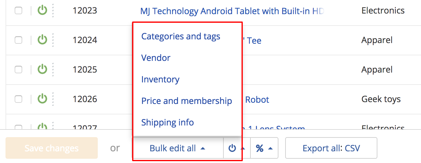
Such buttons are dropdown buttons from Bootstrap: https://getbootstrap.com/docs/3.3/components/#btn-dropdowns
We start with creating a button class \XLite\Module\XCExample\ItemsListStickyPanel\View\Button\DropdownDemo as follows:
<?php

namespace XLite\Module\XCExample\ItemsListStickyPanel\View\Button;

class DropdownDemo extends \XLite\View\Button\Dropdown\ADropdown
{
    protected function defineAdditionalButtons()
    {
        return [
            'demo_two' => [
                'params'    => [
                    'action'    => 'demo_two',
                    'label'     => 'Demo Two',
                    'style'     => 'always-enabled link',
                ],
                'position'  => 100,
            ],
            'divider' => [
                'class'     => 'XLite\View\Button\Dropdown\Divider',
                'params'    => [
                ],
                'position'  => 200,
            ],
            'demo_three'    => [
                'params'    => [
                    'action'    => 'demo_three',
                    'label'     => 'Demo Three',
                    'style'     => 'always-enabled link',
                ],
                'position'  => 300,
            ],
        ];
    }
}
This class extends \XLite\View\Button\Dropdown\ADropdown one, instead of regular \XLite\View\Button\Regular. We will specify parameters like label and CSS style from inside defineButtons() method, so we will focus on inner elements of dropdown button in this class.
This dropdown button has three inner elements:
- Link with 'Demo Two' label that submits a request with 'demo_two' action. This link has style
always-enabled(the same as before, it means that it is active no matter whether there are changes in the main ItemsList's form or not) andlinkwhich renders this element as a regular link, not a button with borders. - Divider element with no additional paramaters.
- Link with 'Demo Three' label that is identical to first element, but it submits a request with 'demo_three' action.
After that let us add this button to our sticky panel. For that we define \XLite\Module\XCExample\ItemsListStickyPanel\View\StickyPanel\DemoEntity::defineButtons() method as follows:
protected function defineButtons()
{
    $list = parent::defineButtons();

    $list['mybutton'] = $this->getWidget(
        [
            'action'    => 'demo_one',
            'style'     => 'always-enabled',
            'label'     => 'Demo Button 1',
        ],
        'XLite\Module\XCExample\ItemsListStickyPanel\View\Button\DemoOne'
    );

    $list['dropdown'] = $this->getWidget(
        [
            'label'             => 'Dropdown Demo',
            'style'             => 'always-enabled more-action',
            'useCaretButton'    => false,
            'dropDirection'     => 'dropdown',
        ],
        'XLite\Module\XCExample\ItemsListStickyPanel\View\Button\DropdownDemo'
    );

    return $list;
}
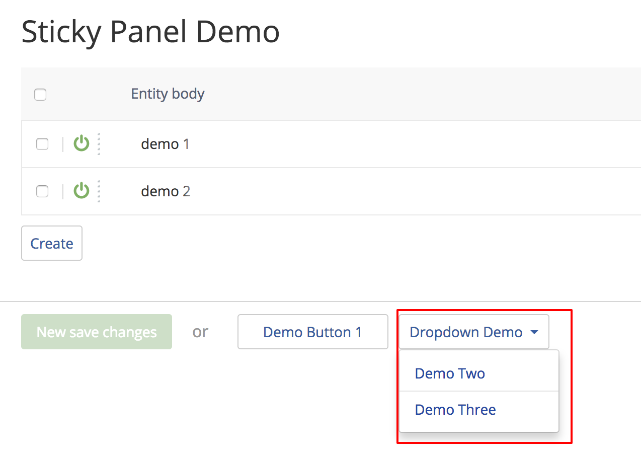
We see here a button from the previous paragraph ($list['mybutton']) and dropdown one ($list['dropdown']). It has already known 'label' and 'style' parameters.
- Having
more-actionCSS style is needed in order to allow proper rendering of dropdown button. - 'useCaretButton' parameter asfalseis needed in order to render the caret icon inside the button. - 'dropDirection' parameter defines how the dropdown list will be expanded: upside or downside. In our case it will expand to the bottom.
Once you refresh the page, you will see this button in sticky panel as follows:
Creating additional buttons
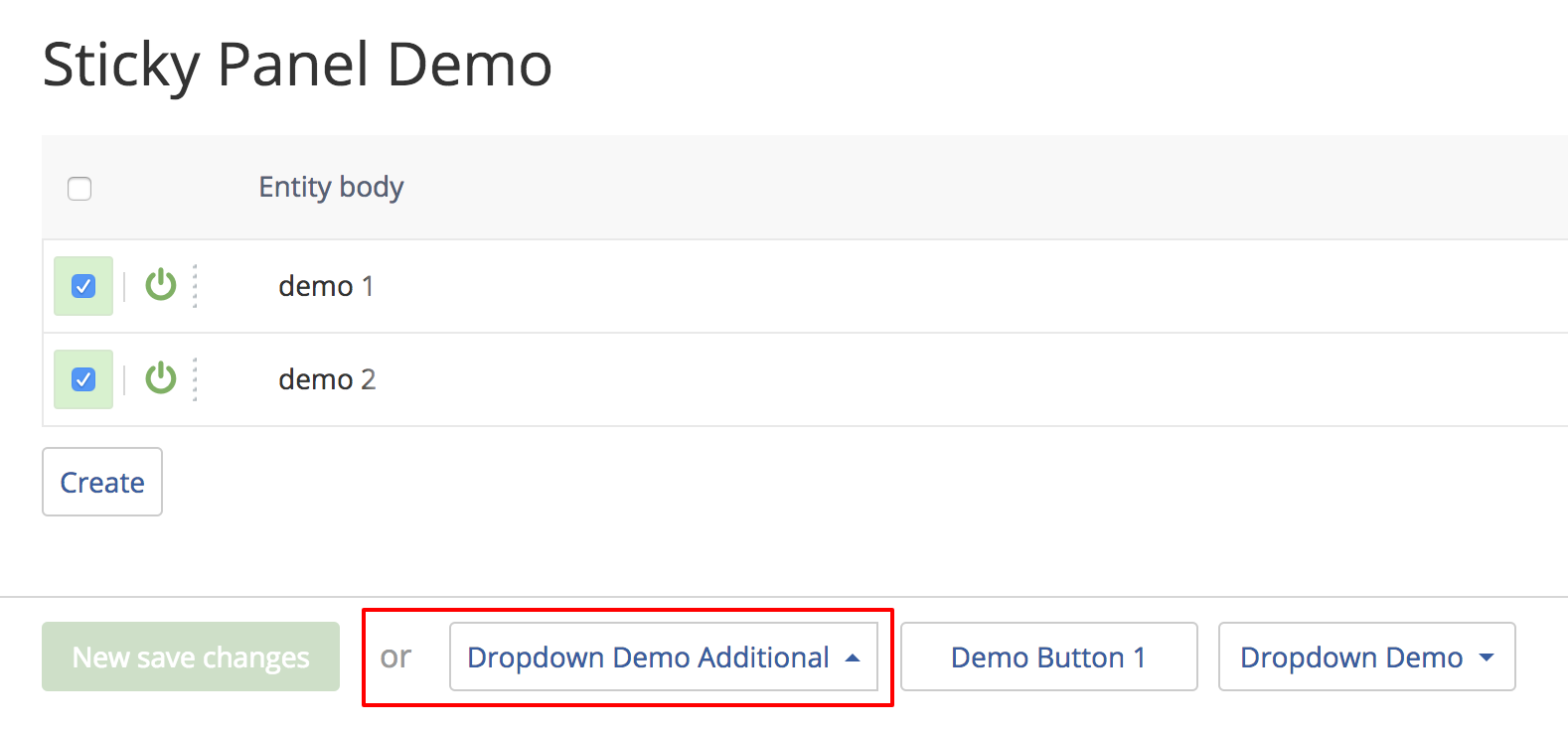
These are buttons separated by 'or' label from main button:

Let us create the same dropdown button from the above paragraph as additional button. However, this button will not be visible unless we select some records.
In order to add such button we create \XLite\Module\XCExample\ItemsListStickyPanel\View\StickyPanel\DemoEntity::defineAdditionalButtons() method as follows:
protected function defineAdditionalButtons()
{
    return [
        'dropdown_two' => [
            'class'     => 'XLite\Module\XCExample\ItemsListStickyPanel\View\Button\DropdownDemo',
            'params'    => [
                'label'             => 'Dropdown Demo Additional',
                'style'             => 'hide-on-disable hidden more-action',
                'useCaretButton'    => false,
                'dropDirection'     => 'dropup',
            ],
            'position'  => 100,
        ],
    ];
}
This method should return an array of arrays, which describe the additional button. Child array must contain three elements:
- 'class' as name of the class that represents this additional button. In our case, it is
\XLite\Module\XCExample\ItemsListStickyPanel\View\Button\DropdownDemo. - 'params' represents parameters of the widget that will be passed to the button's class in order to render it. This parameter is similar to first parameter of
getWidget()method we took a look at earlier. - 'position' element defines where this additional button will be displayed.
There are two differences in this implementation of dropdown button:
- We define 'dropDirection' parameter as 'dropup', so the dropdown list will expand from the top of the button.
- We define 'hide-on-disable hidden' style instead of 'always-enabled'. In this case, the button will be hidden by default ('hidden' class), but it will be displayed once we select any records in the ItemsList ('hide-on-disable' class).
When we refresh the page, you will see 'or' label, but no additional button.
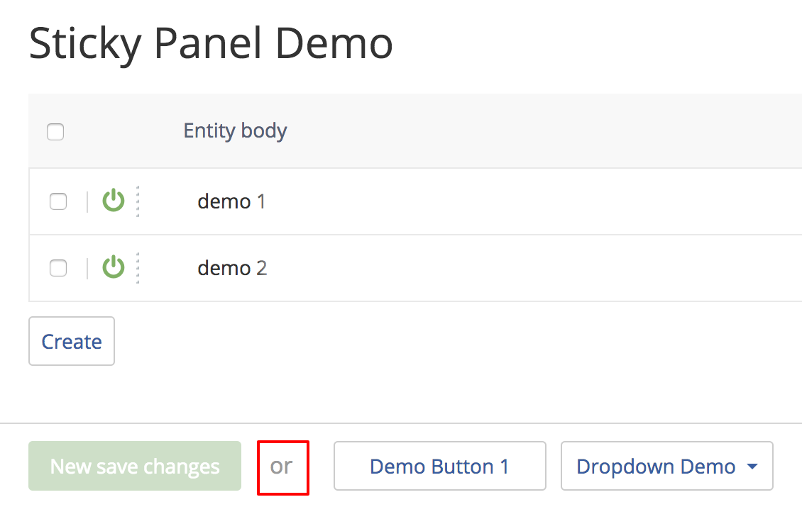
Once you select any records, it will show up:
Module pack
All code examples described in this article are available as a module here: XCExample-ItemsListStickyPanel-v5_3_0.tar